

Knox Configure allows enterprises to remotely configure Samsung devices in bulk and tailor them to specific need, right out of the box. Used by 4000+ enterprise customers on more than 8 million devices world-wide and support 9 languages world-wide.
My Contribution
As the product design lead, I helped to navigate the project through the design thinking process with product managers, development team. I also contributed as a product designer and I helped to write the script for user interviews, wireframe, and developed new components to the design system.
Collaboration
Director of Knox services, Product managers, Technical product manager, Design team, Dev team, UX researcher
Roles
Product strategy, Interaction Design, Visual Design, Prototyping
Softwares used
Figma, Fig-jam, Adobe suite
Why redesigning profile creation process?
Knox configure going to through transition from B2B to B2B2C service.
Bad user experience as users has to go through lengthy process, complex feature navigation and suboptimal information architecture.
Project and business goals
Creating and managing a profile needs to be easy & intuitive for new and existing customers with shallow learning curve.
Better user experience will allow greater adaptation by enterprises.
A process that can be implemented in other Knox services.
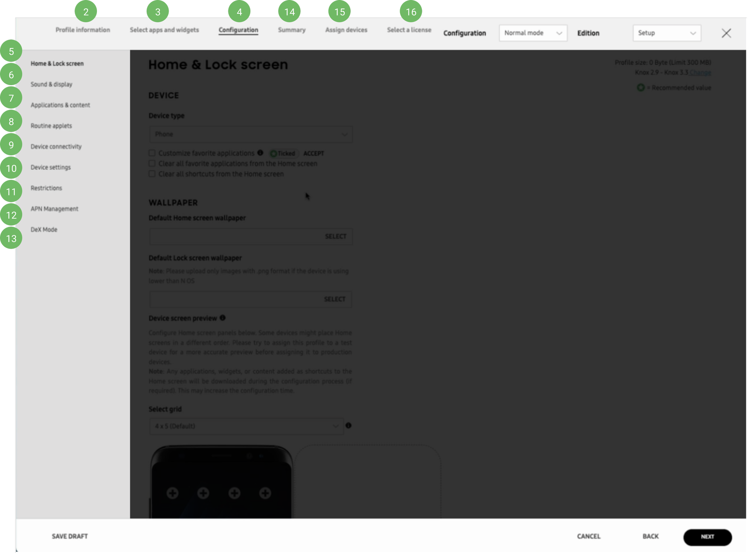
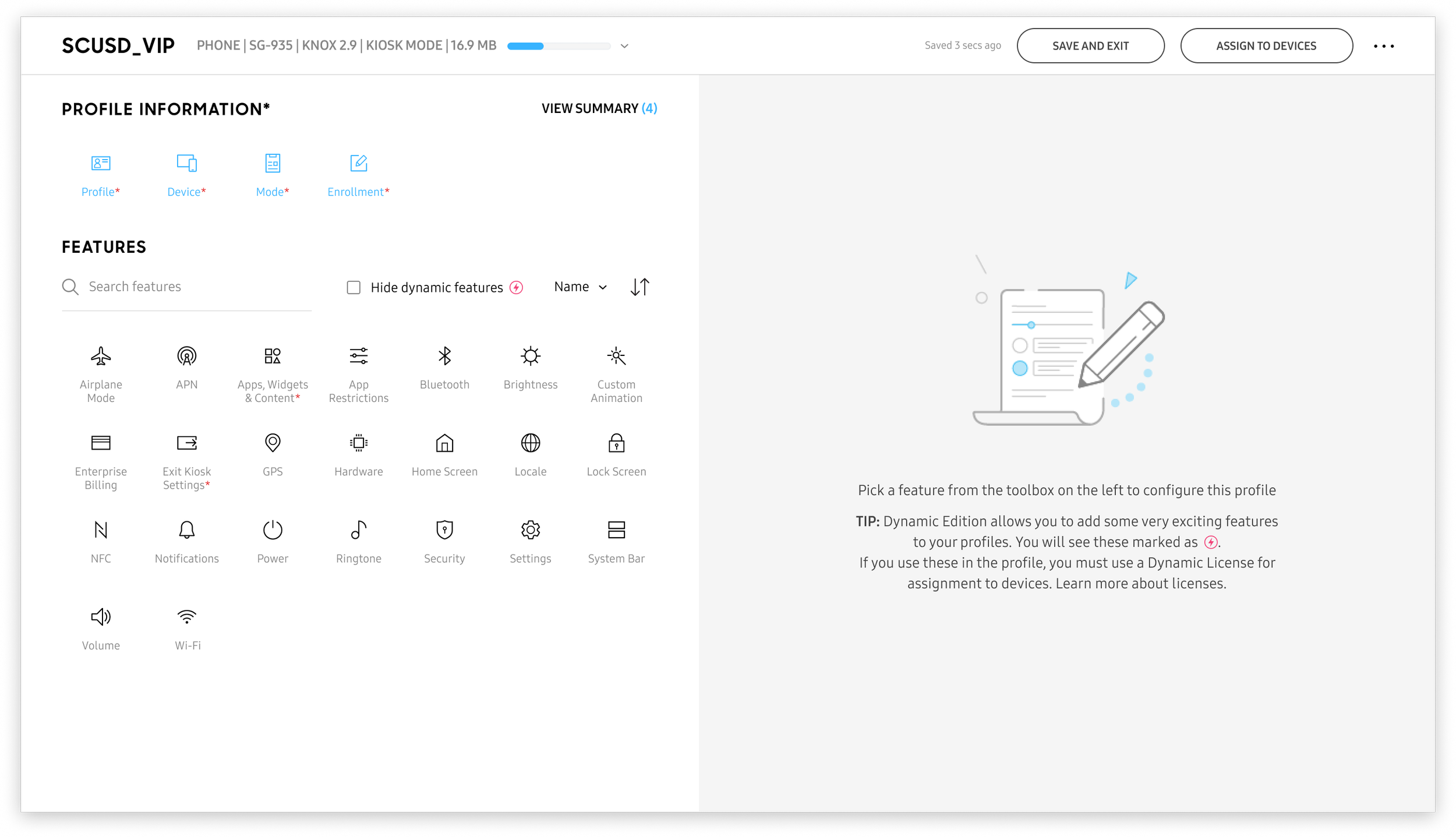
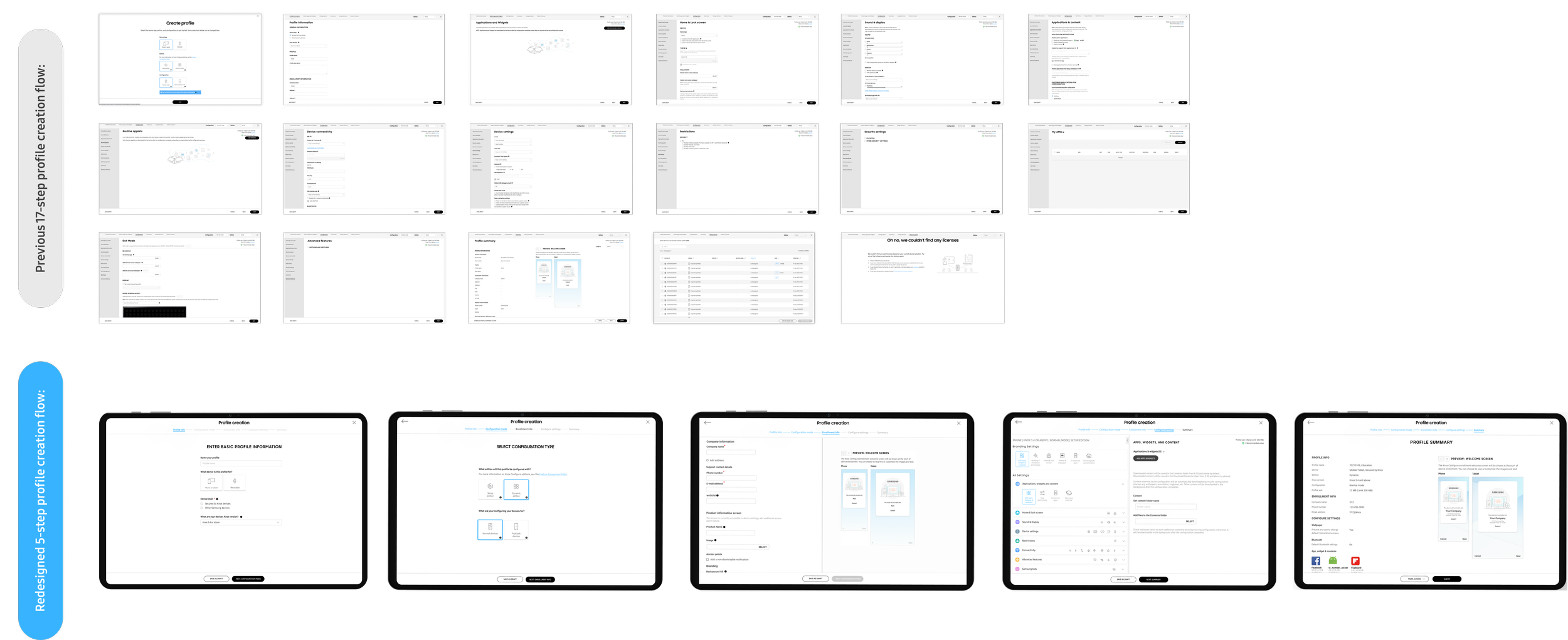
Starting point: Current profile creation process
Each green circle represents a step user had to take in-order to create a profile.
Analyze: Understanding problem space

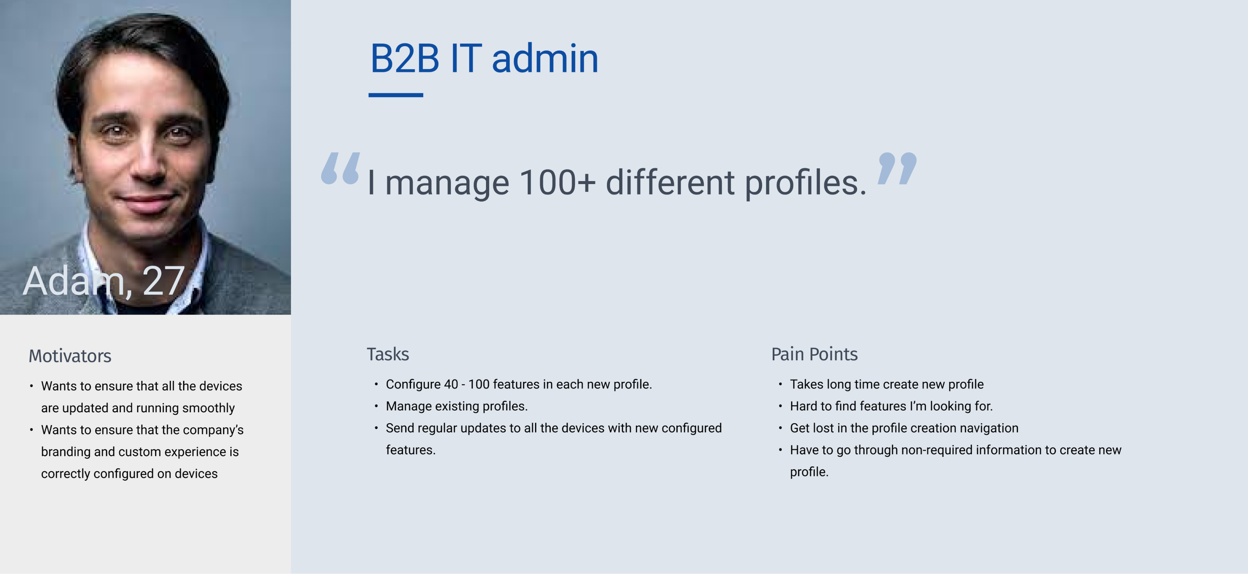
Analyze: Persona (B2B IT admin)
Analyze: Persona (B2B2C IT admin)

Ideation: Brainstorming
Step 1 Card sorting: synthesize our research from interview with sales, understanding: Navigating structure, Most important features, Google analytics to sort most and least used features.
Step 2 Connecting the dots: Identifying gaps in profile creation workflow.
Result: Design principles like emphasis and intuitiveness helped to map most useful information and user flow.
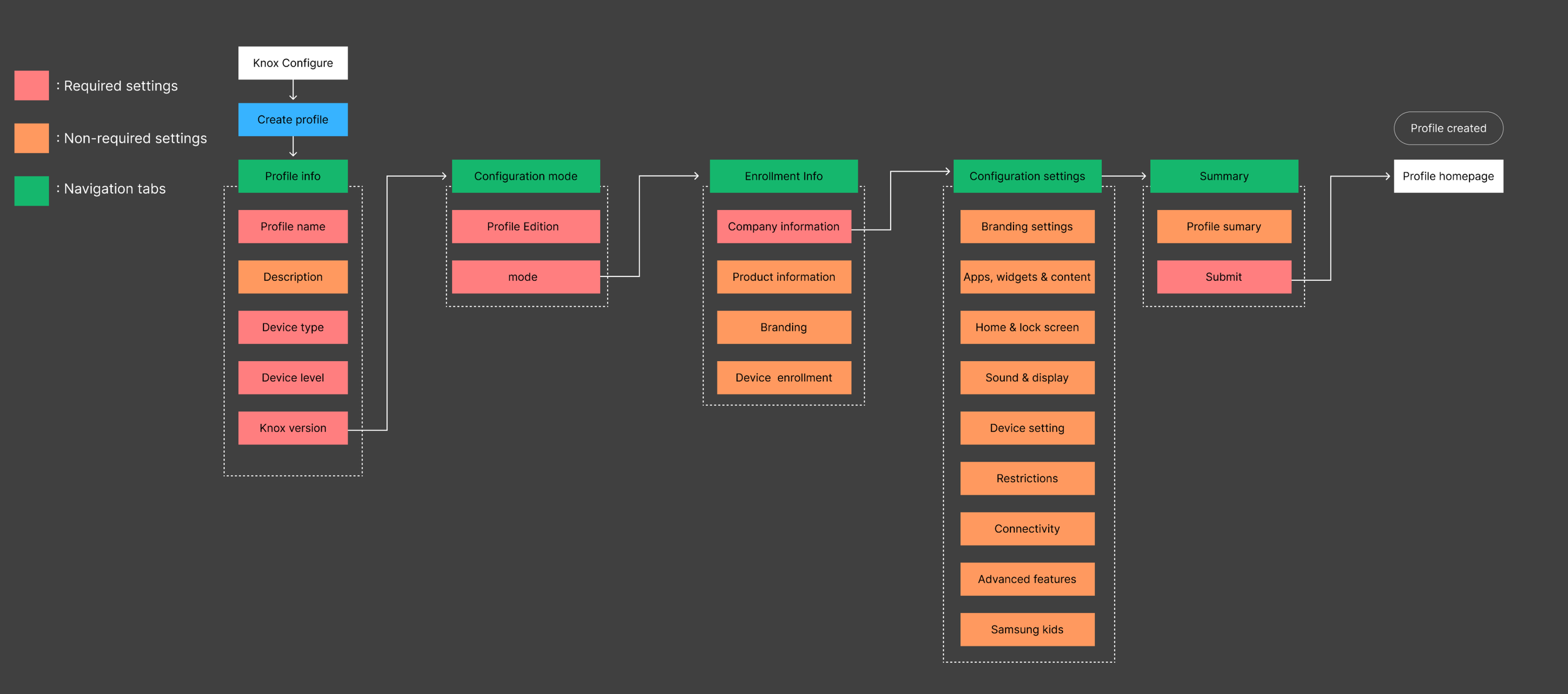
New information architecture
Helped me convince product managers that current mapping didn’t make sense to users.
Simple process to decrease the learning curve for new and existing users
Iteration 1
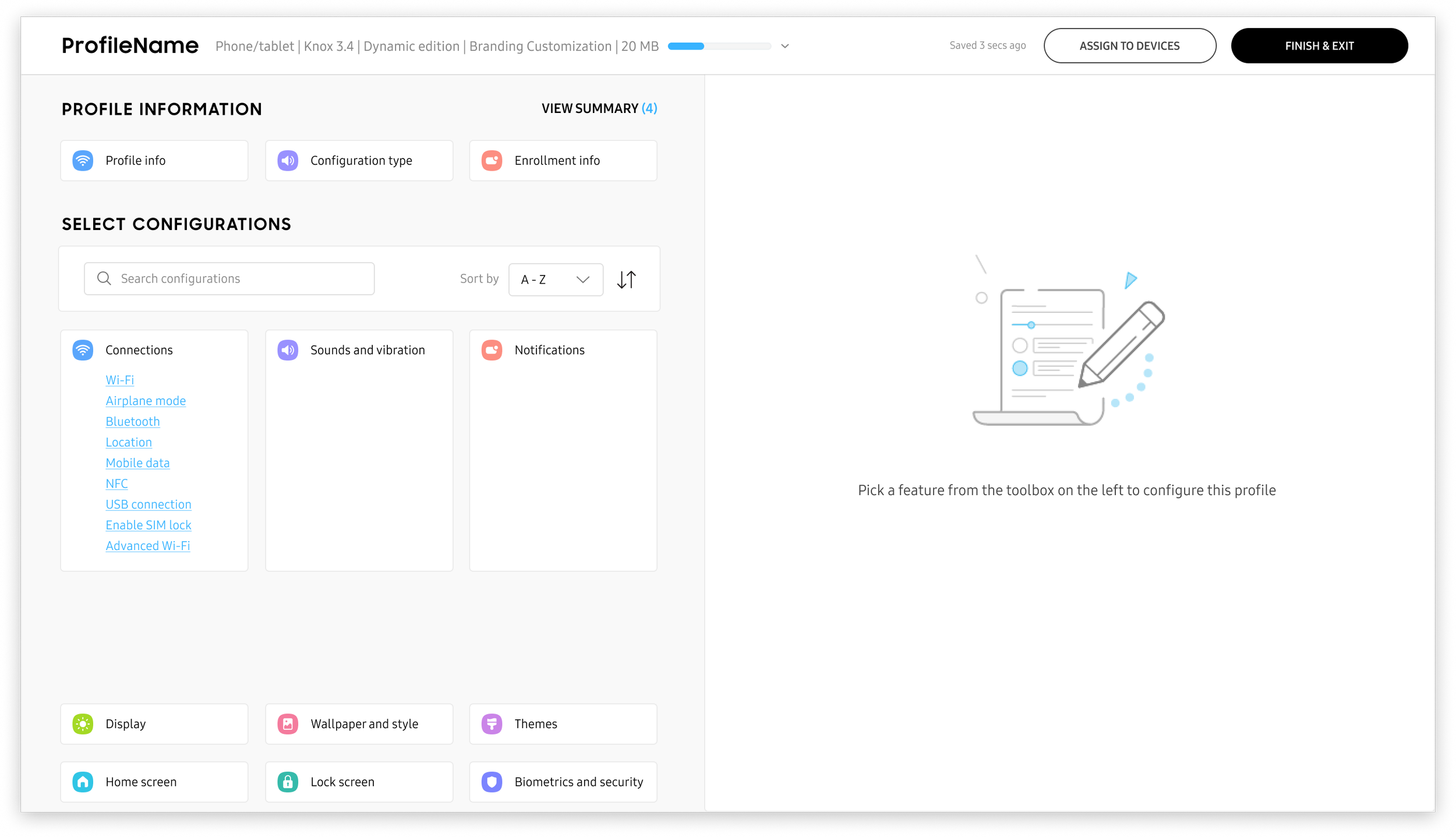
One of the first iteration was to show all the available feature on one page and once user select the feature, show related configurations info on the right panel. The main goal was that user doesn’t have to switch between pages to create a profile. But the biggest problem with this concept was that user didn’t know where to start the flow, there were certain features that were required to fill in to enable other features.
Iteration 2
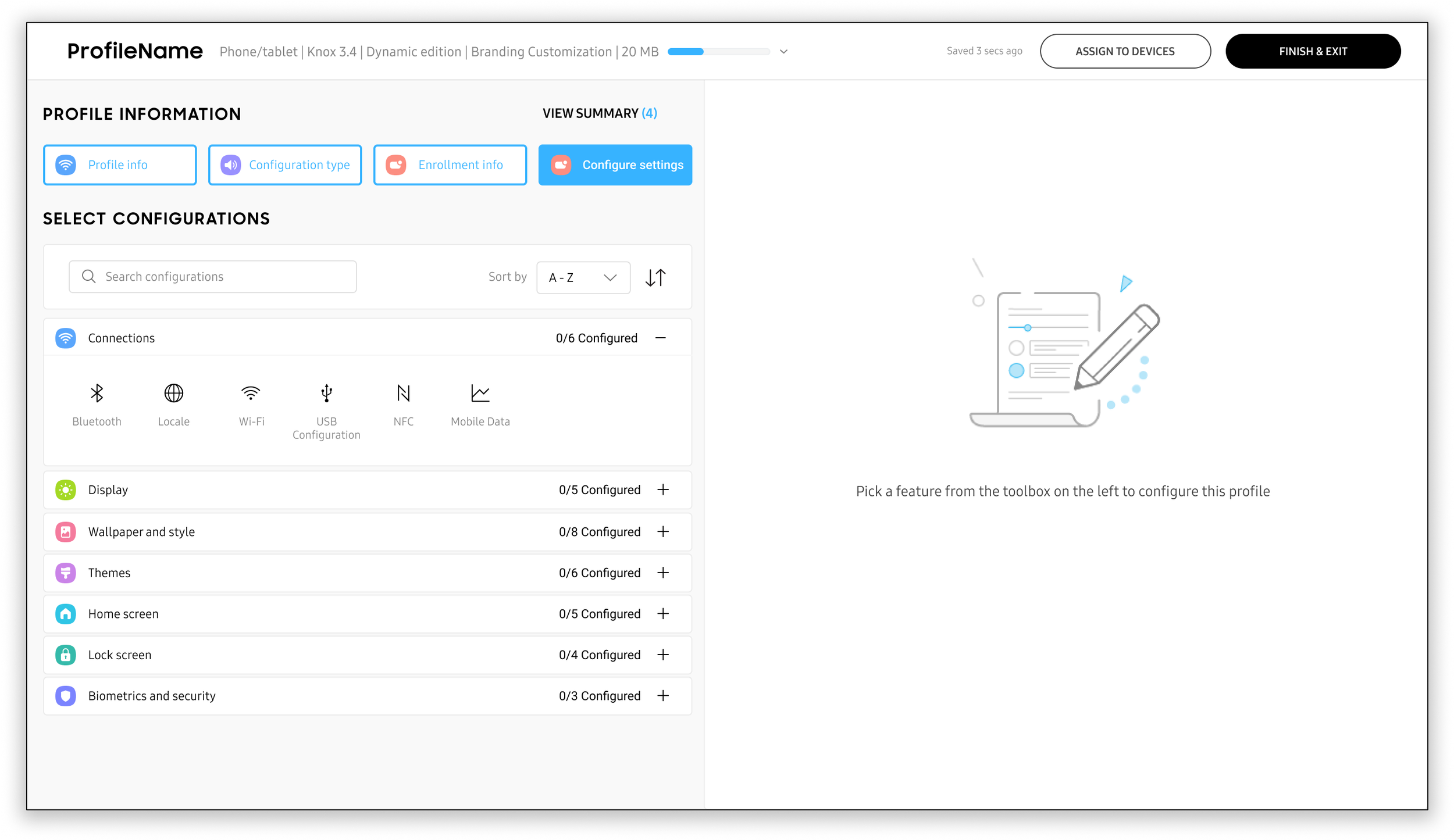
In second iteration I created new categories to make it easy for users. But the problem still existed how user would what steps they need to complete first in-order to complete the profile.
Iteration 3
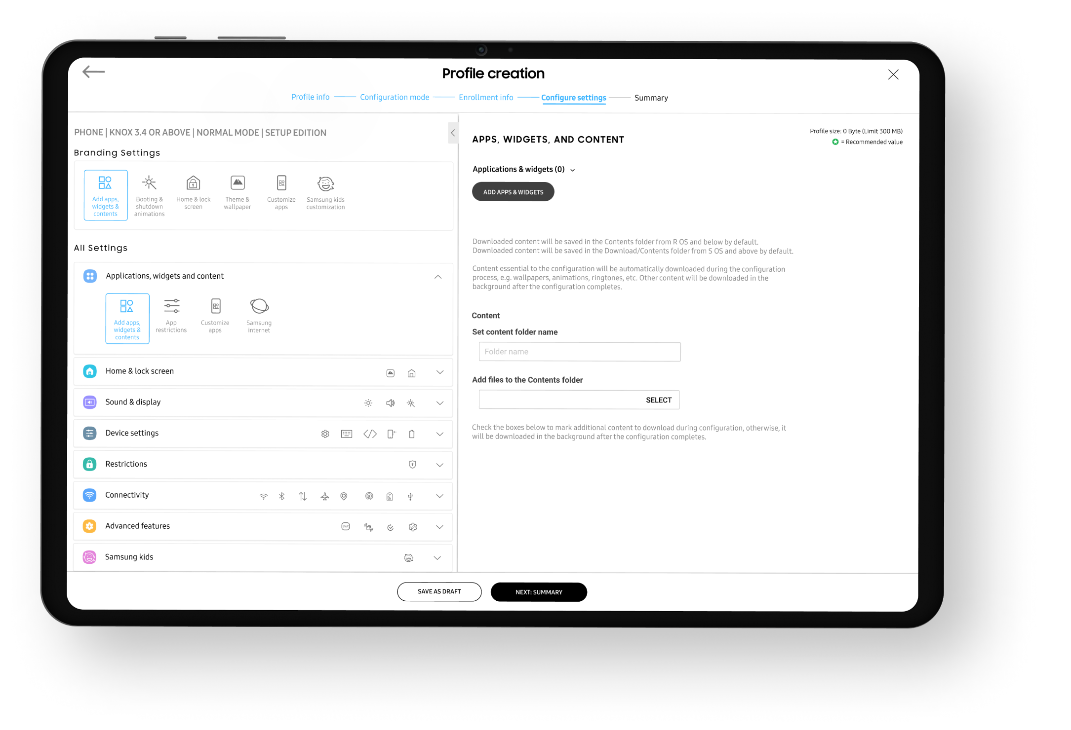
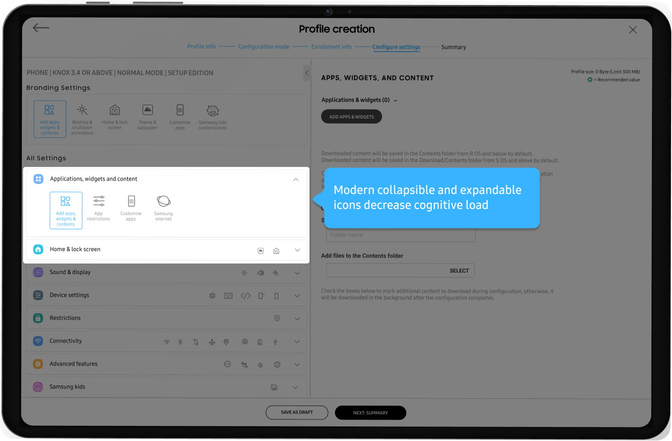
In third iteration to minimize the clutter and amount data on the screen I used accordions, which allowed users to focus on what categories they would like to configure and then expand the accordion to select a feature. I also added search to make easy for user to find features faster. But one of the biggest issues still existed, how to take user from step 1 to step 5 and complete a profile through a process.
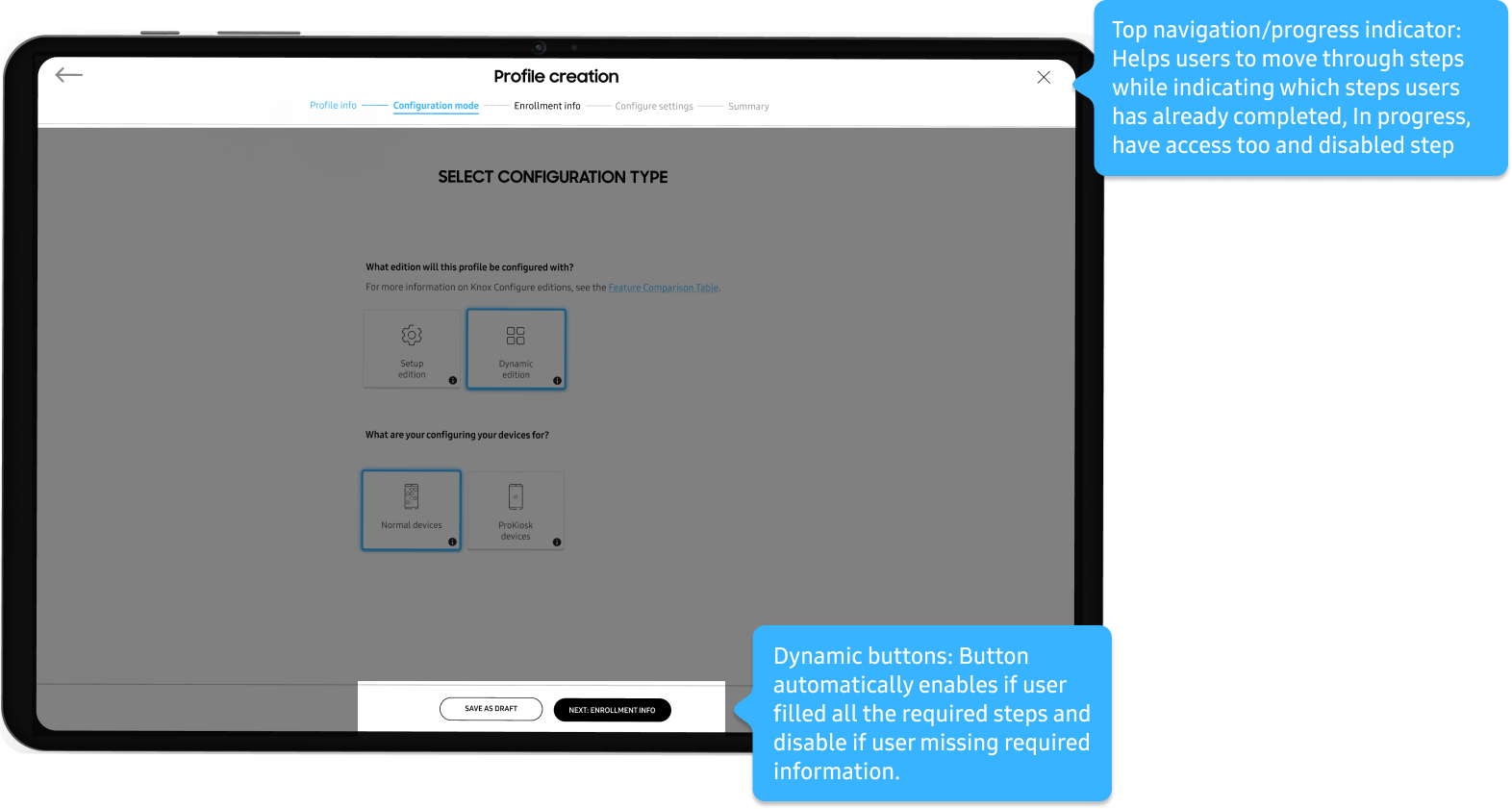
Down-selected decision: A simple and focused experience that directly addresses our user goals.
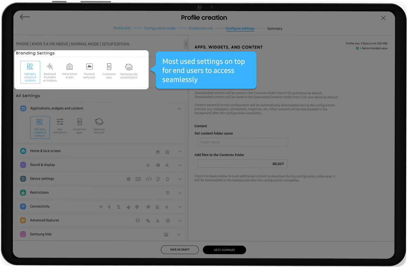
After doing multiple workshops with other designer, product managers and development team. We came on conclusions that user need to see how they moving through step-1 to step-5, also when certain step is not available user should be indicated visually what actions needs to be taken in-order to move to next step. Most used features needs to taken out of the category and display on top left to follow the F-Pattern, I was able to use Google analytics to find most to least used features. Mini features icons in closed accordions for easy feature discoverability and recognition without having to open the accordion.

Design system
Used our Samsung Knox design system to keep all the Knox services consistent, but at the same time created new components to fit user needs while aligning with design system team.
Usability testing
We conducted usability testing with 6 participants using clickable prototype, resulting in 100% task completion rate. We also received some negative feedback as well during our interviews. Unfortunately I can’t share the all detail findings, but here are few comments users made:
“6/6 appreciated the simplicity, white space and ability to slowly see and add information one at a time”
“All participants liked the dynamic progress bar, allowing them to have transparency and flexibility to move between steps”
“Icons allowed me visualize feature category without having to scan through every feature one-by-one” - Participant
“3/6 participants wanted some indication (scroll bar) to represent that there is more information to fill at the bottom”
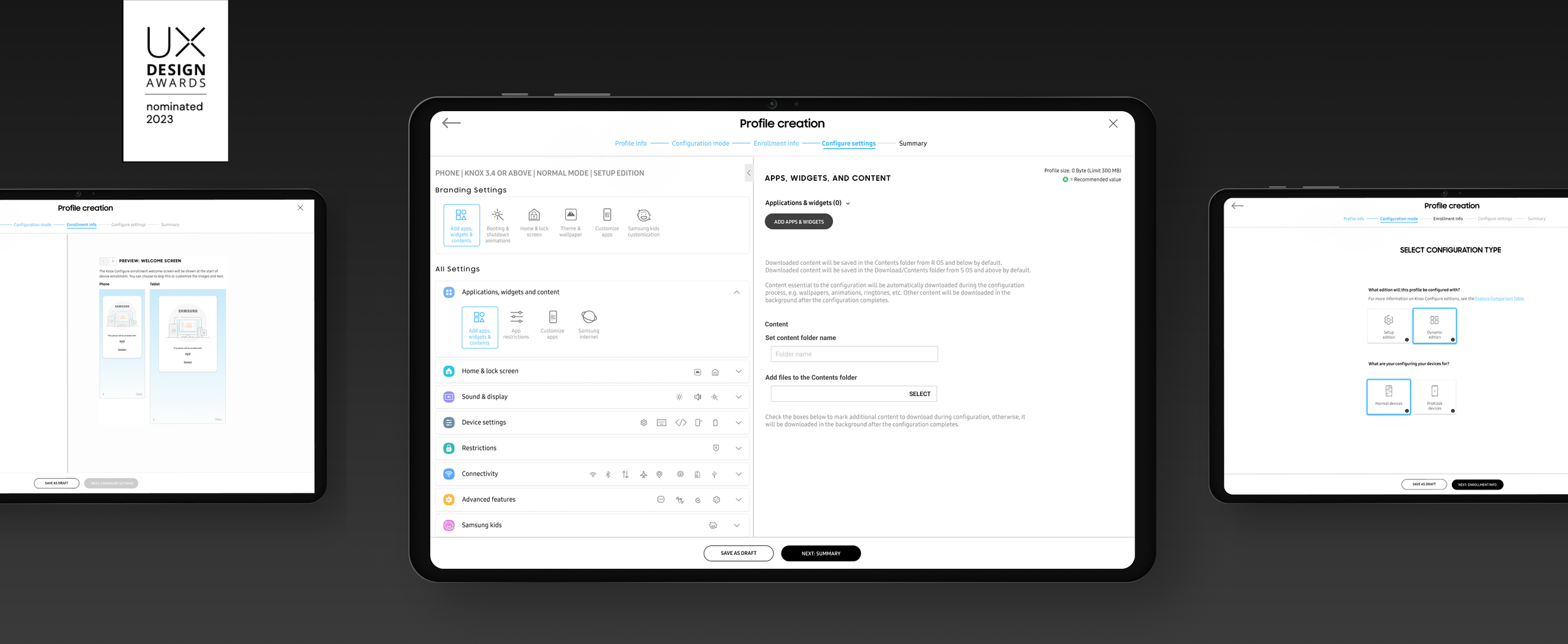
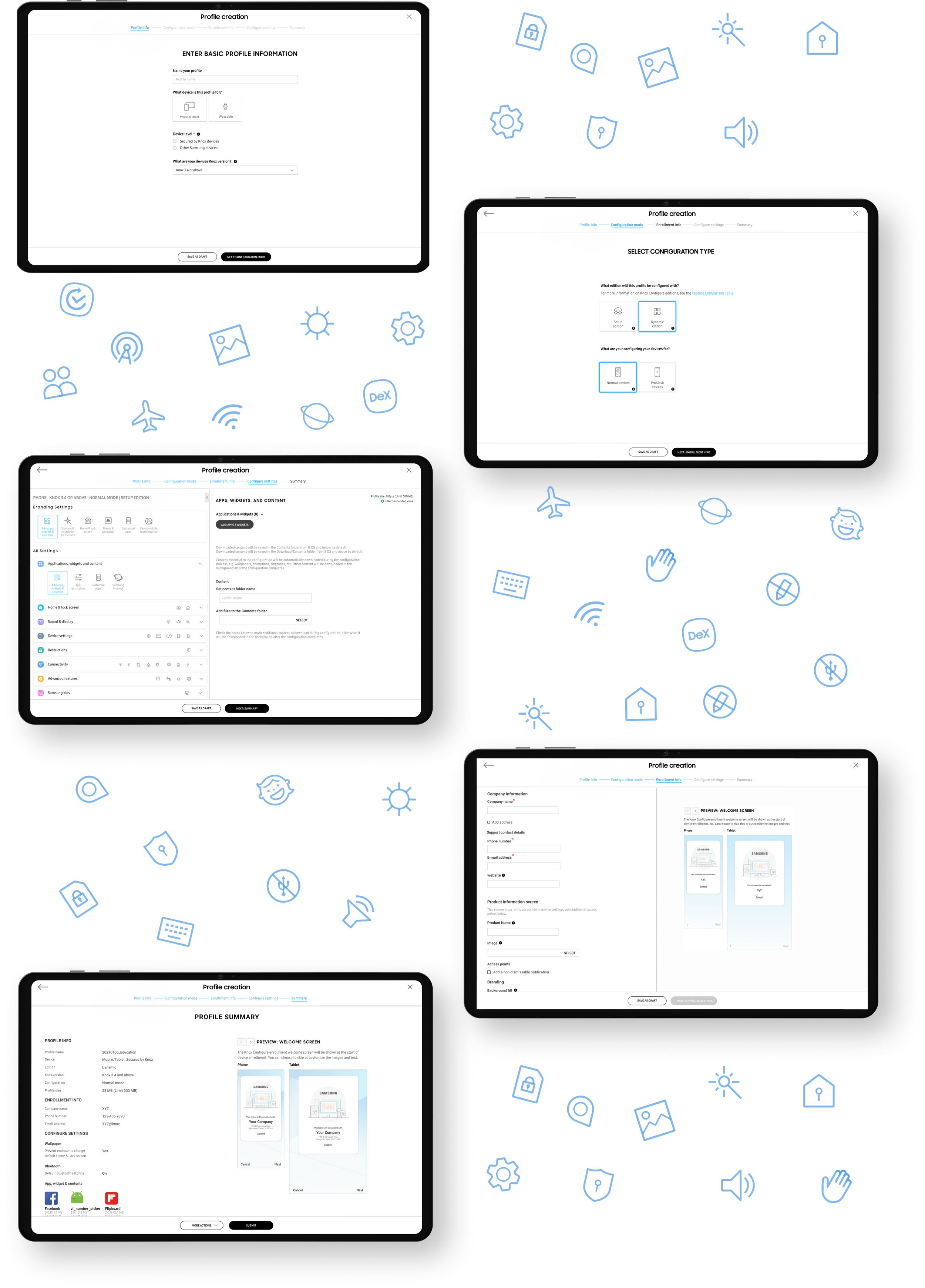
Outcome: Reimagined profile creation process
We completely revamp the profile creation process from navigating through cumbersome 17-step procedure to user-friendly approach that condenses the process to just 5-simple steps.
Our goal was to completely revamp the profile creation process, moving away from the tedious device configuration that involved IT administrators navigating through complex features and enduring a cumbersome 17-step procedure. Through extensive user research and analysis of Google Analytics, we undertook a comprehensive reimagination of the entire process. The result is a streamlined and user-friendly approach that condenses the profile creation to just 5-simple steps. Our focus on simplifying the process ensures a more efficient and hassle-free experience for IT admins, saving them time and effort.
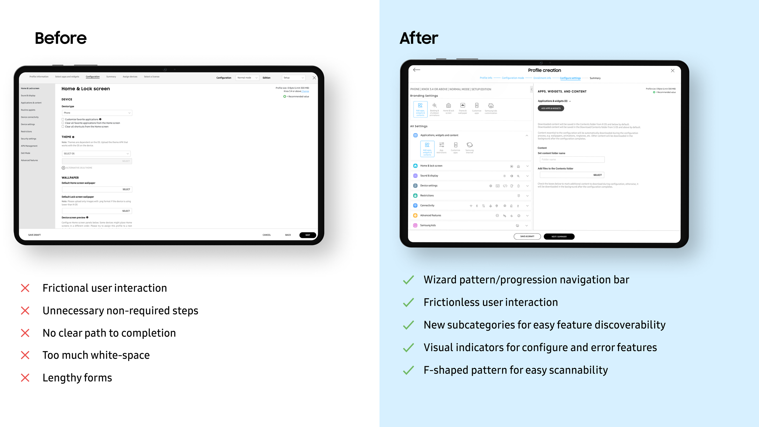
Prioritizing the most used features and easy feature discoverability
Our research indicated that most of users always use these six features while creating profile. With the help of Google analytics we able to move it on top of the feature categories for easy access. While we move all other features in separate categories under accordions. We also use visual indicators for errors, configured feature, non-configured feature.
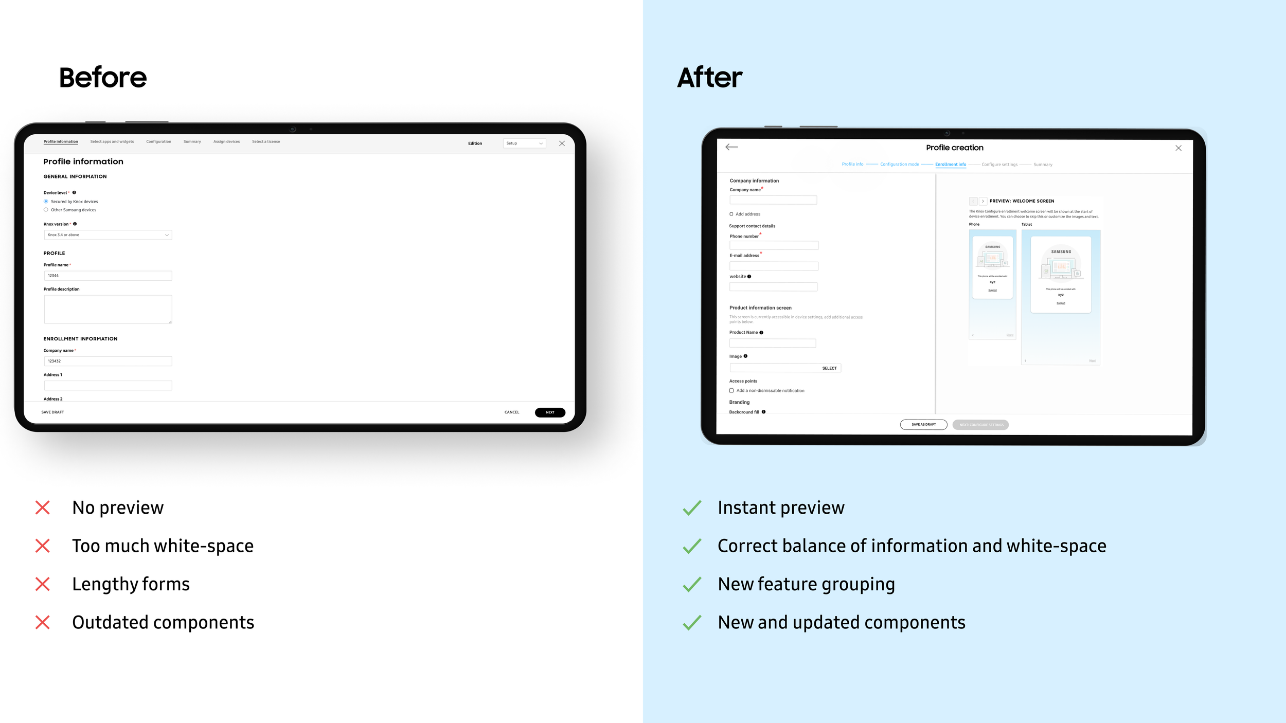
Instant preview
Keeping in mind the purpose of the product is to allow IT admins to customize end-user Samsung devices. IT admins can change wallpapers, themes, animations as well as device settings. Which made it important to have instant preview of how the device would look like once the update is pushed to the end-user. Previously IT admin would add themes, wallpapers, etc and has to go to summary page see the preview. But we recognize their pain-points and created special preview only for enrollment info step.
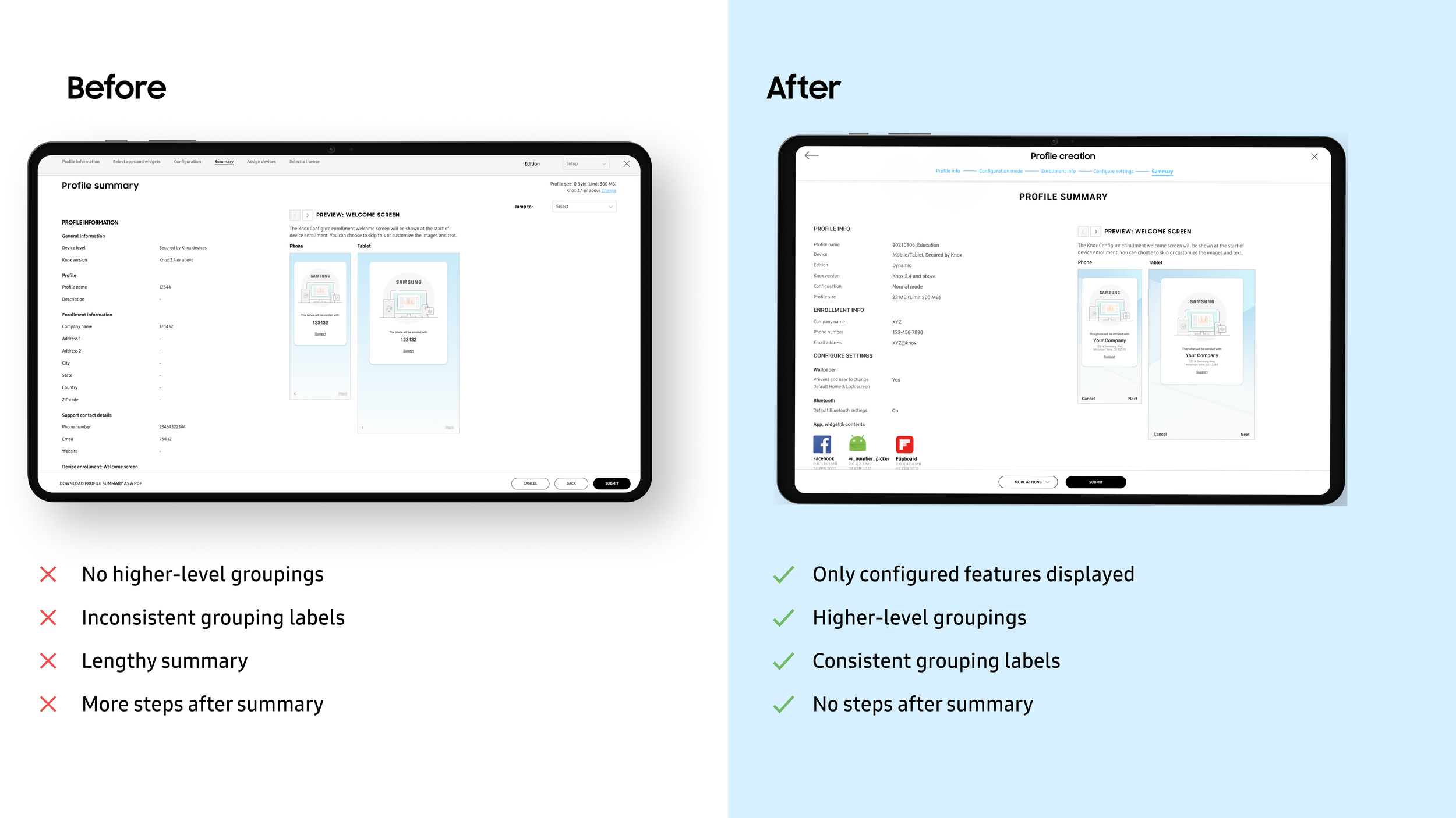
Summary
Previously summary page would contain all the features that were available in the portal. This made it hard for IT admins to find the features they configured. In our competitive analysis we found that summary page should not have all the features that are available in the portal. It should only show the features IT admin has configured while creating or editing the profile.
Hand-off to development team
Full UX guide for every interaction of profile creation process with detailed guidelines.
Impact
After the successful launch in May 2023, here are key impacts:
100% adoption by existing users.
By working closely with PMs was able to Influence feature roadmap
Successfully launched the new process flow for more than 4000 enterprise customers.
Knox Configure design principles, guidelines and components are already being implemented in 4 other Knox cloud products which would impact 18000+ small and big enterprise customers and millions of users
Next steps
Currently working closely with our UX research team and Product managers to set up first set of customer interviews and surveys since launch.
Click here to learn more about Knox Configure