Knox Configure - Empowering enterprises to customize and automate their Samsung devices, right out of the box
Leading Knox Configure through a strategic pivot from B2B service only for enterprises to B2B2C service that would serve consumers as well. I guided our ensemble, which included three PMs, team of engineers, TPM, while keeping our design team and director of Knox services aligned with our strategy. In conceptualizing and directing a four-phase strategy, we redefined information architecture and bolstered our user-focused approach, producing significant outcomes: Task completion time decreased by 30%, Customer satisfaction score increased from 60 to 95, thereby enhancing both user satisfaction and team morale.
Role:
Lead UX designer
Timeline:
Jun 2022 - Currently
Core responsibilities:
Product design lead, product strategy, visual design, prototyping, illustrations/icons
Problem & Insights
Admins struggle to locate features while creating or managing profiles, leading to frustration and endless scroll through feature categories
Though Knox Configure allowed admins to create and manage device profile through cloud portal to customize and automate Samsung devices, many admins were disappointed due to the reasons below: creating and managing profile should be seamless, a key ingredient our tool initially lacked.
Non-linear navigation, feature overload and lack of guidance
Leaving users to fend for themselves
Goals
Getting lost in the process impacts users experience
This could lead to abandonment, loss of trust and negative experince
Refocusing Knox Configure: From feeling overwhelmed by the sprawling feature set to specializing in clear guided process
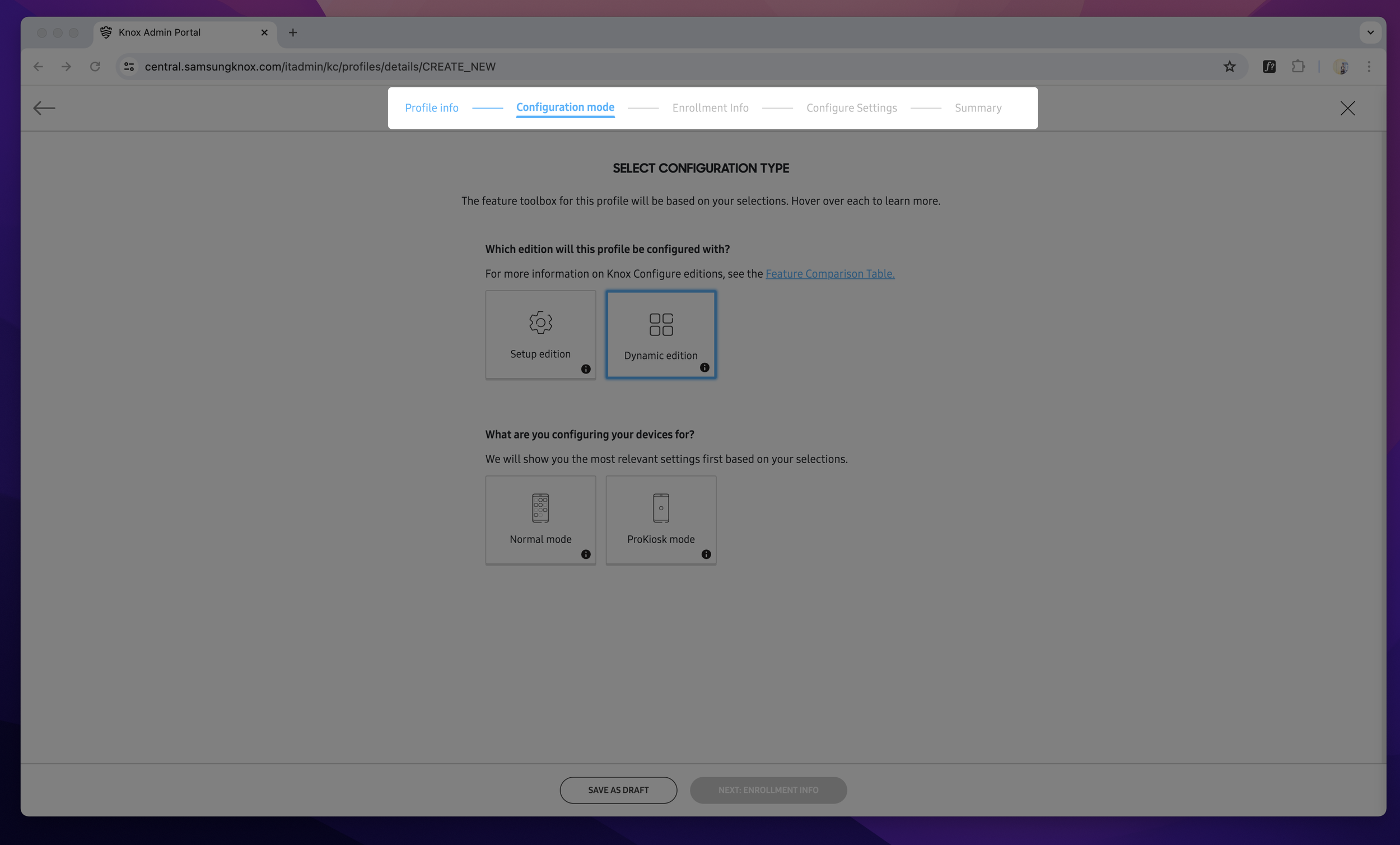
Leadership’s pushed for Knox Configure to be a B2B2C service from B2B service, in which user has a clear path to configure their most desirable features, such as branding features that would allow business to customize their devices and sell smart customized accessories. Challenging this, I redirected my focus towards a concentrated emphasis on facilitating clear profile creation process. Guided by user feedback and recognizing overextended feature set, I organized a four-phase strategy that enhance profile creation efficiency, swift feature detection, progress awareness and offering a preview to redefined platform, concurrently uplifting user experience and team spirit.
Solution
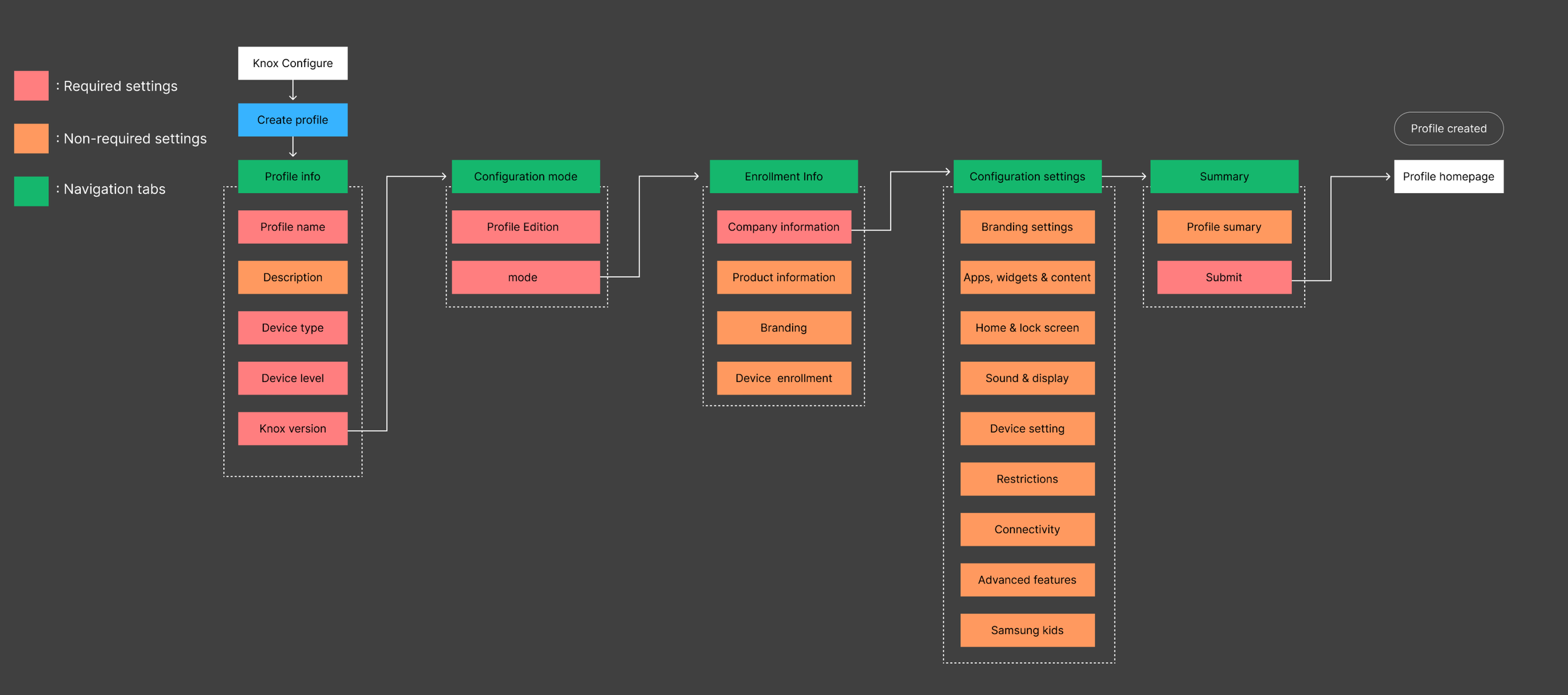
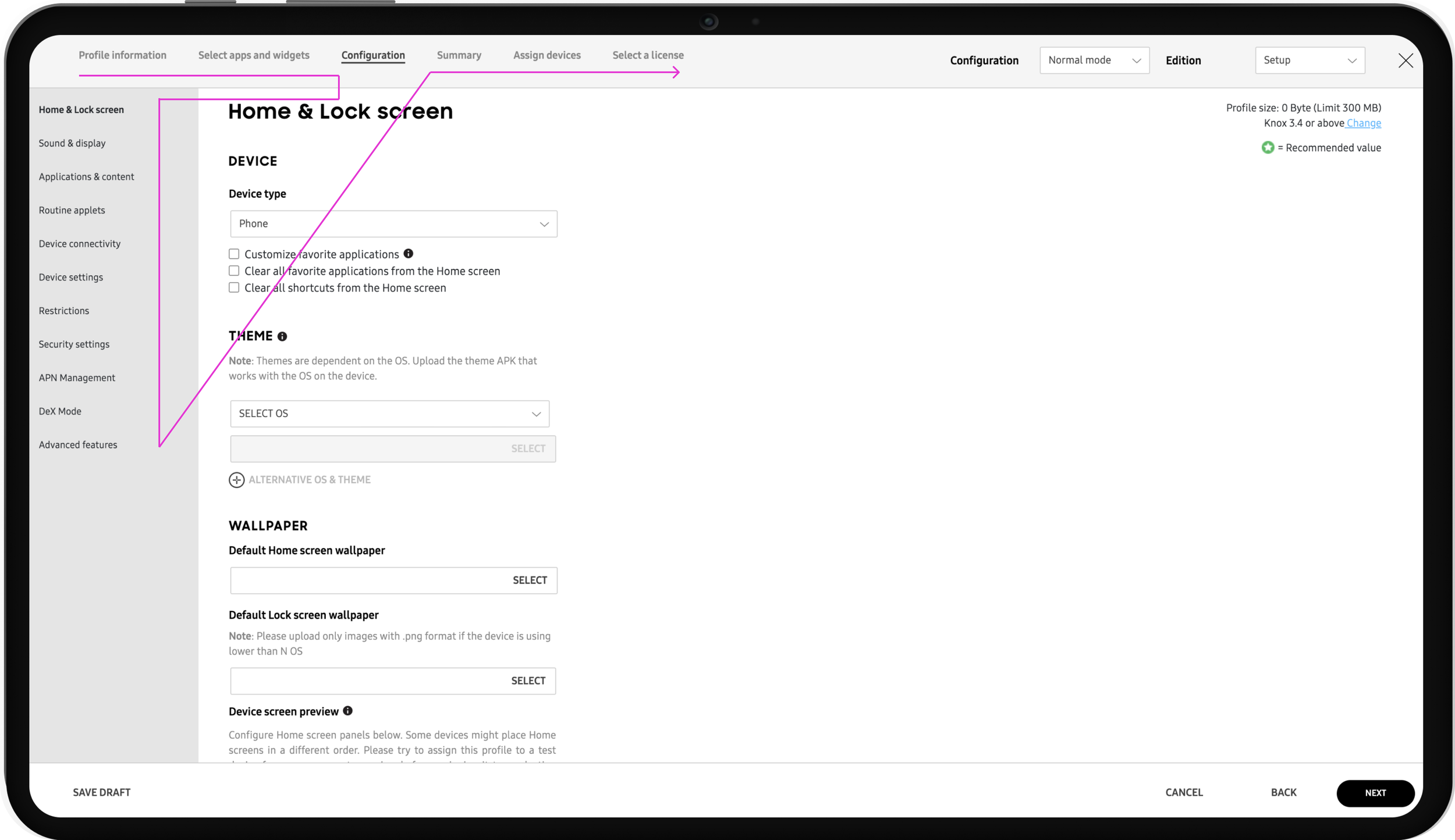
Providing five step profile creation process, intuitive to navigate and redefined feature hierarchy to optimize profile setup expereince
As I directed the product design, my efforts pivoted Knox Configure from a cumbersome process to a dynamically active, user-centric interface, intertwining continues with sufficient breathing room and effortless feature identification. My strategic emphasis shifted from a purely overloaded features and steps to one that harmoniously melded progress awareness with easy to follow process, thereby notably enhancing user experience and efficiency enabling them to managing and creating profiles seamlessly.
Shifting from Knox Configure being cumbersome process to seamless experience
Feature page + information architecture
Before
Passive and something fragmented
After
Ability to discover features effortlessly, category and feature hierarchy that follows F-shaped pattern for easy scannability
Strategic phase 2 of 4
Provide swift feature detection to improve usability, drive user value, and increase user satisfaction
Incorporating the F-shape pattern referencing Google analytics to discern the features with the highest and lowest usage rate. In collaboration with product managers during our workshop, we utilized the card sorting method to rearrange features, ensuring a balance between product managers preferences for user-facing features and the features most commonly used by users. Our PMs proposed creating separate category for most used features and that align with business goals. To provide swift feature detection I proposed creating feature categories, sub-categories for discovering features effortlessly.
Reconstructing feature categories based on data
From endless scrolling to effortless configuring features
Before
People were spending lot of time discovering features. If already configured, no indicator for user
After
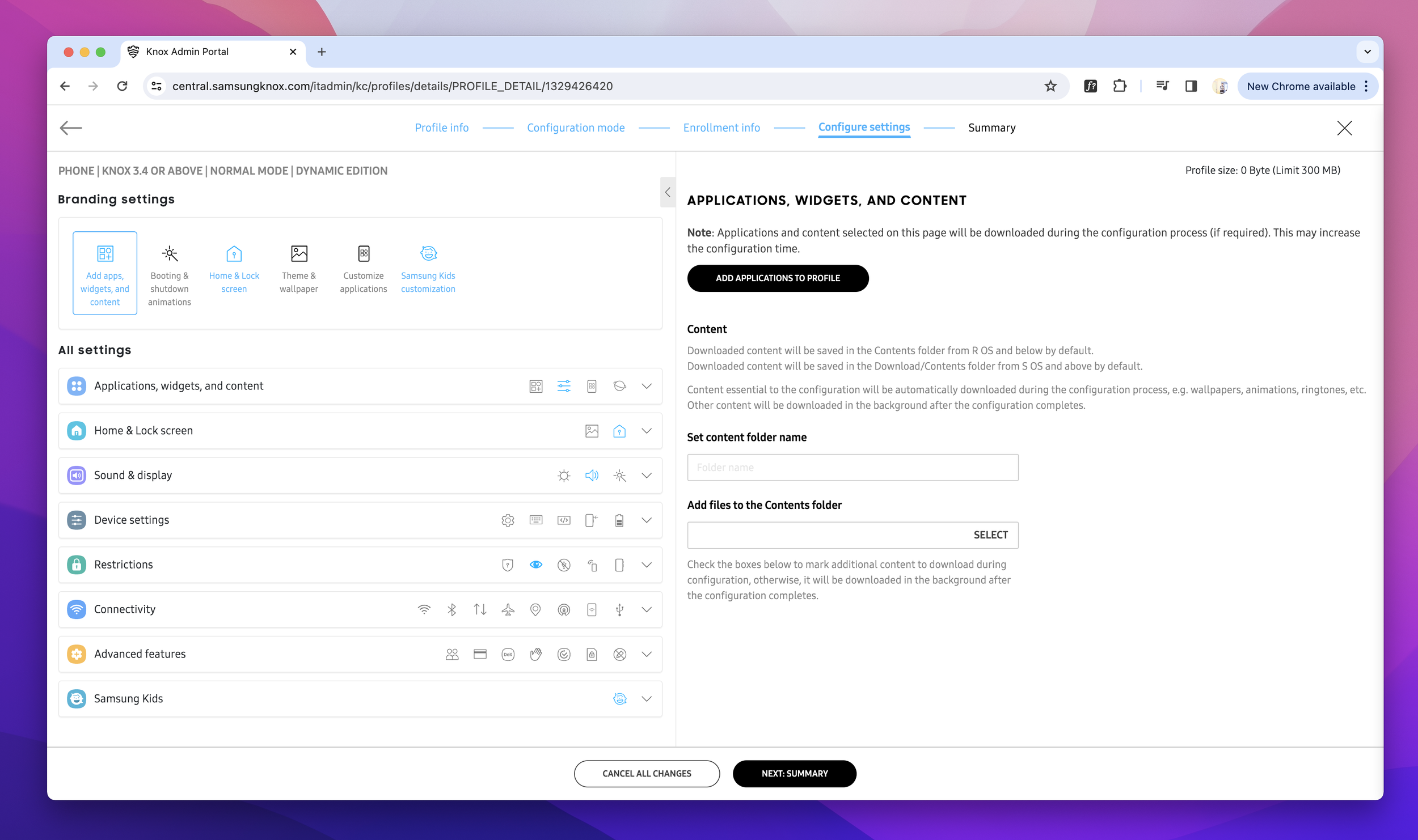
New categories and sub-categories created with icons for faster feature recognition.
Eliminating extra white space on right and adding breathing room for categories, sub-categories allowed us to refine and enrich both the feature discoverability and get rid off endless scrolling. While reducing manual user effort and increasing the efficacy of our profile creation tool.
Visual indicators for configured and non configured features
Blue icons and text allow user to differentiate between which features they already configured and which they haven’t.
Strategic phase 3 of 4
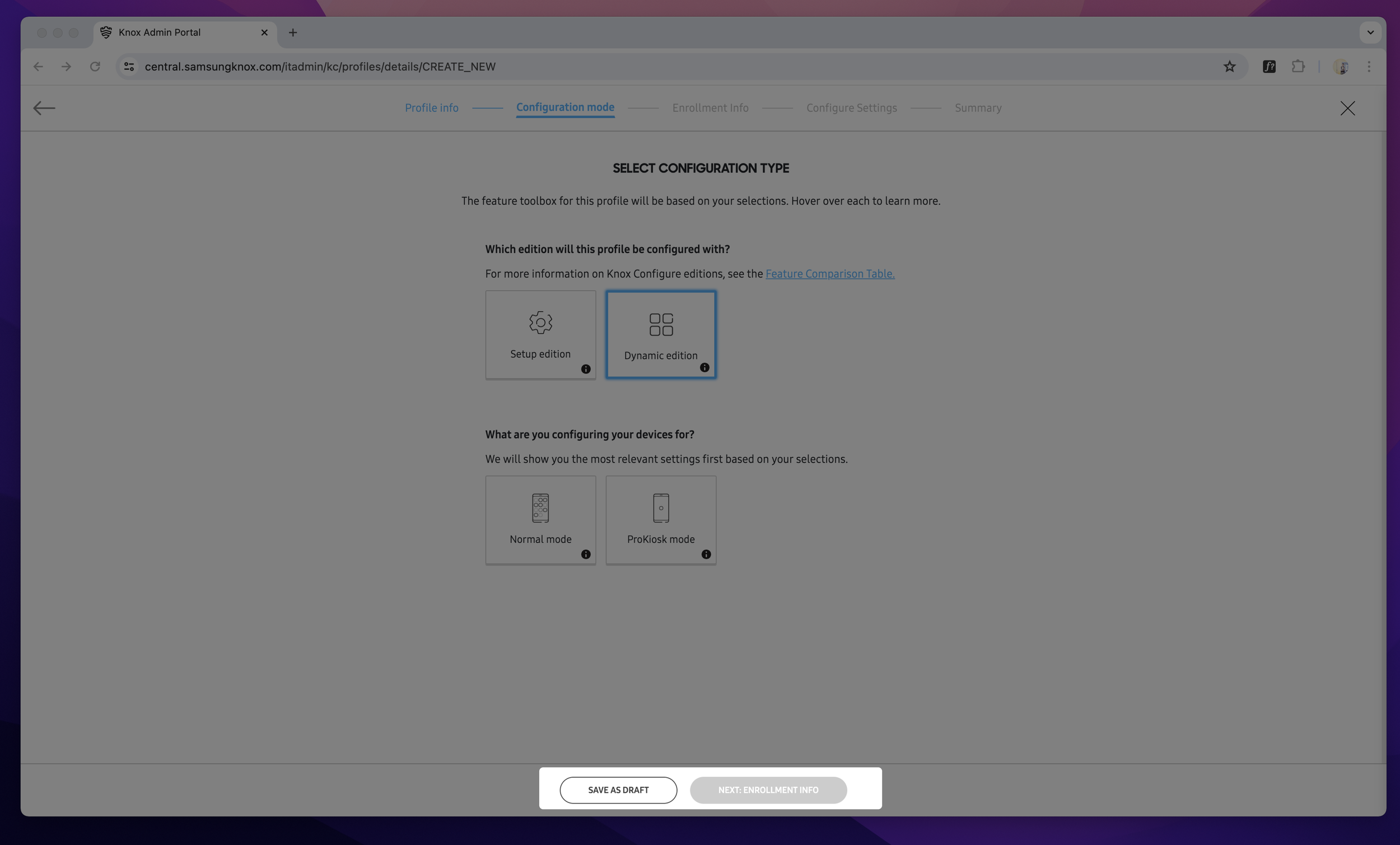
Giving users progress indicator to increase completion rate and decrease task completion time
With an objective to craft a transparency for user to know where they are in the process, allowing user to stay on their guided path. I spearheaded a brainstorming session, ensuring we enhance usability and site structure.
Dynamic progress bar
Giving transparency by enabling and disabling steps when required fields are complete.
Dynamic buttons
Enable when required fields are complete.
Reflection
A redesigned navigation, engaging design style making sure engineering efficiency and a cohesive design system. Through rigorous user testing and shift to transparent user flow, we achieved a coherent aesthetic across the platform, with optimized site architecture that prioritize user actions and streamlines their journey by giving continues feedback.
Strategic phase 4 of 4
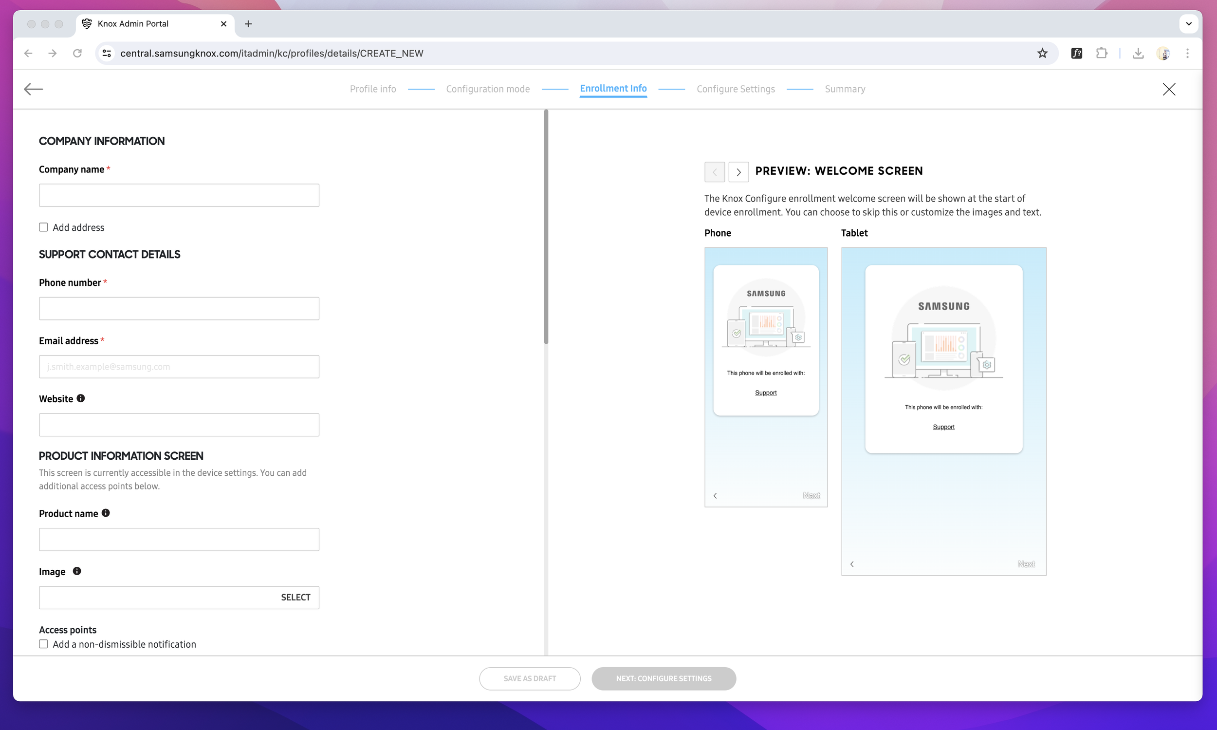
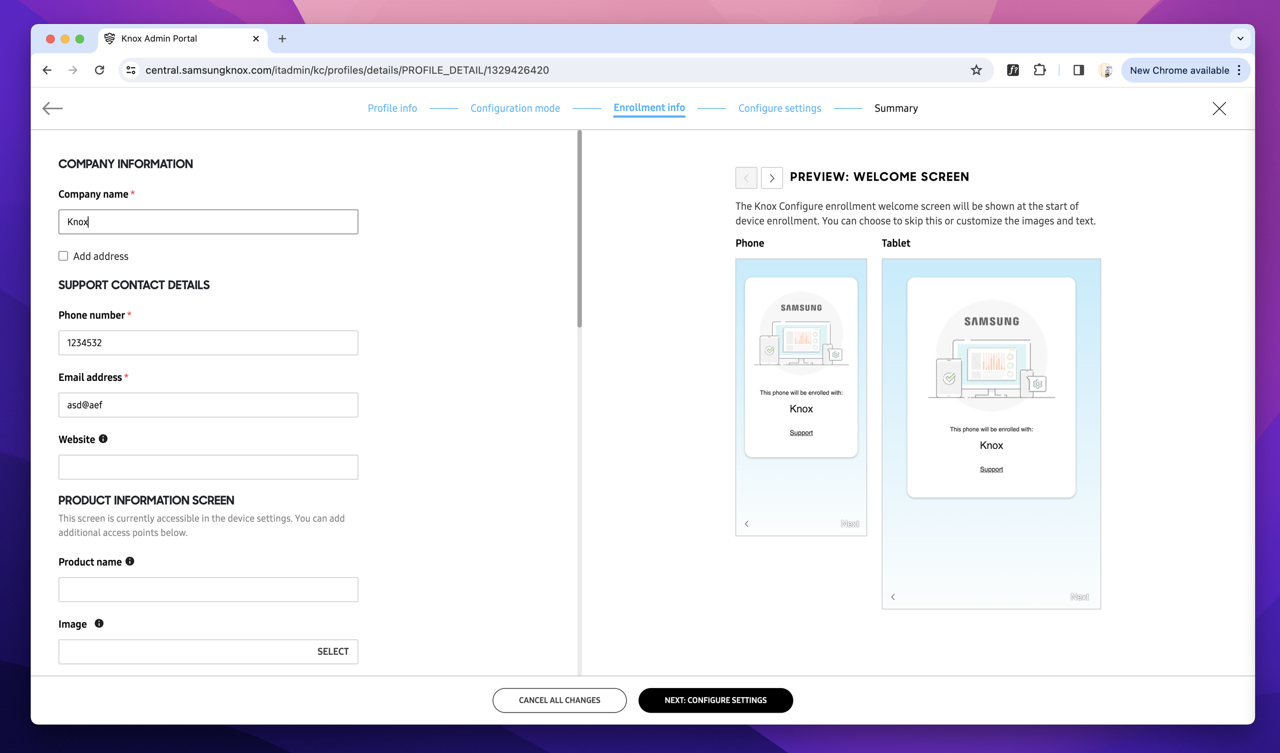
Real-time preview allowing users to visualize customization made to the Samsung devices
In our initial research phase one of the biggest user pain points we discovered was not having device preview while customizing devices, it was like drawing eyes closed not knowing how the end result would look like. I crafted preview in a way that preview only apply for features where user configuring visual customization.
Preview
Allowing users to visualize configurations
User testing & Iterations
Harnessing feedback from user testing to refine Knox Configure’s user experience
Our user testing aimed to collect crucial user feedback on the redesigned Knox Configure. Users loved the visual feedback by using different colors to indicate configured features, progress indication and valuing the easy five-step process. However, some participants wanted some indication (scroll bar) to represent that there is more policies to configure at the bottom.
Embracing failure as part of the process, Improving my ability to influence cross-functional and departmental teams through empathy
Our Although I had successfully influenced cross-functional teams in the past, but venturing into such a large scale project was uncharted territory for me. Initially intimidated by scale of the project while influencing Knox Cloud Services executives, product managers, design team put lot of responsibility on my shoulders. I adapted by asking questions to understand their specific needs and familiarize myself with their perspective.
I found the multi-faceted power of design. It wasn’t about redesigning an interface but changing the way we though how the user experience should be. In spearheading brainstorming sessions and deep-diving into one-on-ones, I realized the true impact of actually listening and empathizing with users and team members. During this project, I learned that a designer, armed with purpose and passion, can bring important force for user experience transformation.
Shifting focus from verbal to emphasizing visuals for clearer communication
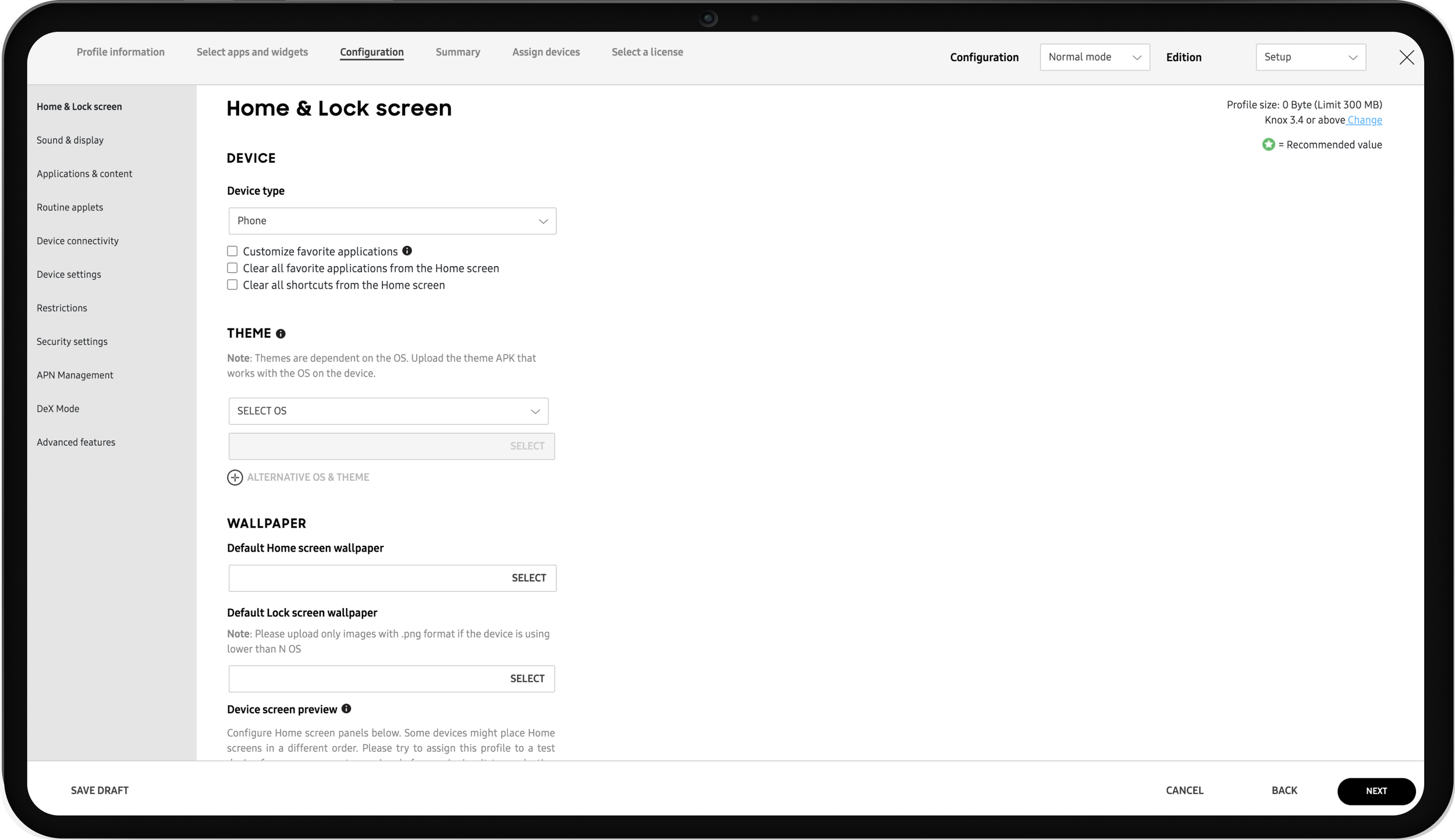
Real-time preview
Before
User-configured device personalization without real-time visualization
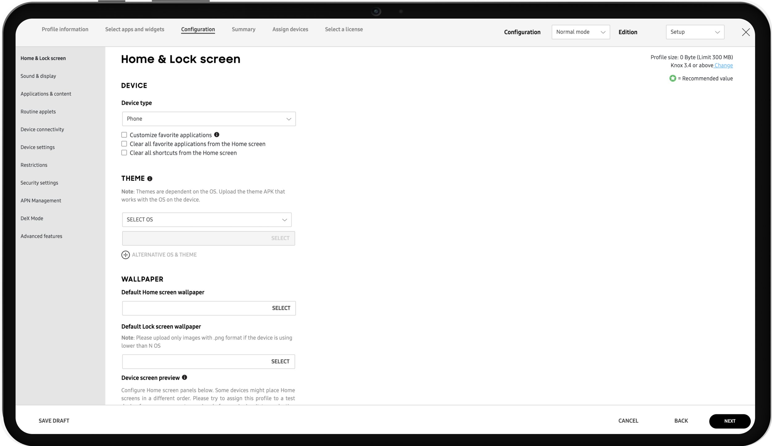
After
Allowed users to immediately preview their profile adjustments and visualize how the device appearance would be altered in real-time
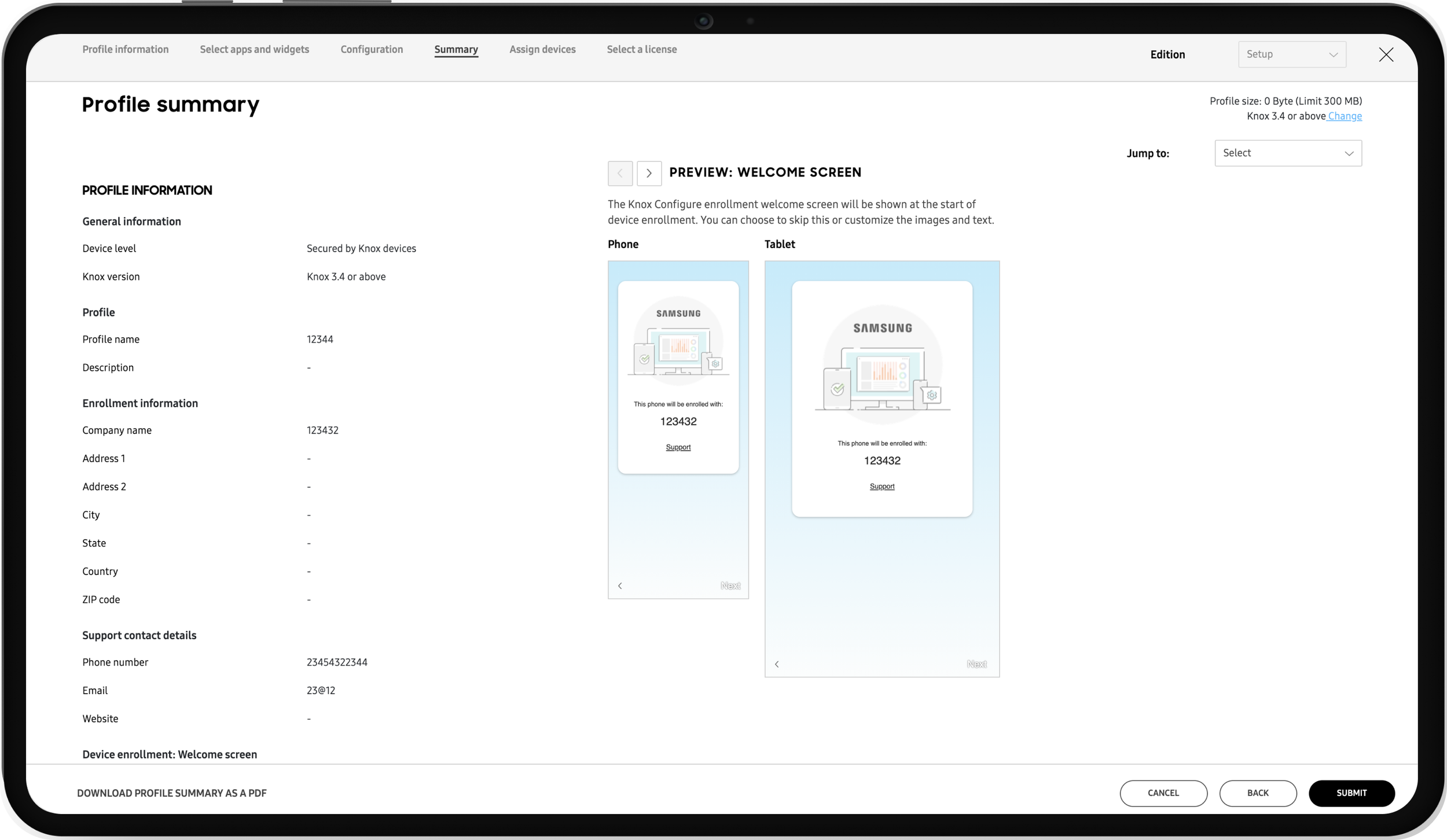
Streamline by condensing lengthy summaries, and reducing subsequent steps
Before
Jumbling user-configured and non-configured elements simultaneously not only overwhelms users but also significantly disrupts their focus, leading to confusion and frustration.
After
Allowed Embraced a sleek card layout to elegantly categorize content, curating a streamlined experience that showcases only configured features while introducing fresh groupings for effortless navigation and scanning
Result
Culminated in a 58% increase in user satisfaction score from 60 to 95, while also decreasing task completion time by 30%.
Feedback from users paints a vivid picture of the impact: many laud the revamped UI for a smother user journey, while others highlight in user interview how they would like see these features in other Knox Cloud Services. A recurring sentiment is the newly found ability to visually differentiate between features already configured vs non-configured, minimizing information overload, real-time device preview and providing users frictionless experience. We took Knox Configure profile creation process from cumbersome 17-step procedure to 5-simple step.
Strategic phase 1 of 4
Enhance Knox configure profile creation efficiency to increase team morale, decrease information overload, decrease technical complexity
I initiated exercise to refine Knox Configure profile creation process, spotlighting those that were anchors to the user experience. In collaboration with PM, UX researcher and engineering team, we carefully evaluated each step, considering user task completion time, user engagement, complex user flow and technical complexity, leading to a strategic 72% step reduction. This tactic guided me in reshaping the Knox Configure information architecture, creating a streamlined, effortless navigation, concurrently minimizing engineering effort by 15%.
Transitioning from a cluttered, complex steps to a streamlined one
Post-meeting feedback details
Before
Lack of straightforward path for users to setup their profiles
After
With help of our UX researcher we used our research from interview with sales and Google analytics to understand: navigating structure, important steps. This helped me creating new information architecture.


